So I dropped the ball on that Wikipedia App comparison. Two things happened simultaneously which lead me to just forget the whole idea. First, I realized every single Wiki App out there sucks. They're all slow, quirky, or shallow. Second, visiting Wikipedia results from a Google search in mobile Safari started automatically pushing me to the mobile Wikipedia site. Perfect! The mobile Wiki site is fast, familiar, and easy to navigate. I really don't see why you'd bother with a seperate app, especially since many of them cost money!
Among other changes around here, we're going to be hearing from a friend and former colleague of mine, Pete Buletza. Pete is developing iPhone apps now, and spends a ton of time annoying me with iPhone app recommendations. I assure you he knows what he's talking about. In fact, a few of the comments on here have been by him (NullPtr). So there's that. I'm not sure what his timeframe is exactly but you should be seeing a post from him here within the next few days.
Now that the clerical stuff is out of the way, I'd like to tell you how to spend the last $5 in your wallet. Civilization: Revolution is simply the best iPhone port of a full game I've ever seen. I've been playing it for a few days now, and most of the time I honestly can't tell the difference between Civ on the iPhone and on my Xbox 360. Despite long initial load times, the game plays quickly and smoothly. It's easy to just pull it out of your pocket, play a few turns, and go on about your day. Once I've spent a little more time with it, I'll write up a full review with screenshots and all. But trust me, just go ahead and buy it now, and find out for yourself.
Thursday, August 27, 2009
Thursday, June 18, 2009
10 iPhone Tips And Tricks I Didn't Know About A Week Ago
We take a break from our regularly scheduled programming to bring you a list of cool things you can do with your iPhone. Some of this might be obvious, and some of it might be totally new! Either way, I'm sure you'll learn something!
1) Cut/Copy/Paste
Easily the most talked about feature in the new 3.0 software is the ability to cut, copy and paste text or images. All you have to do is double-tap to select text, drag the blue markers to grow or shrink your selection, then press cut or copy. Then, double-tap any type-able area and hit paste. (this should work in all iPhone native apps, and I've found it works in many third-party apps, too!)
2) Scroll to the top of the page instantly in Safari.
This is one that had been bugging me forever, until I finally found out the secret! No matter how far you've scrolled on a web page in Safari, if you tap the "top bar" (where the time and battery indicator are) you'll instantly jump to the top. Awesome.
3) Forward or Delete individual SMS messages.
Prior to 3.0, we all had to either delete an entire SMS conversation, or leave it. Now, by pressing the "Edit" button, you'll have the option to "check off" individual messages, and then either forward or delete them. Easy!
4) Press and hold characters on the type pad for new options!
While typing, you can press and hold on, for example, the period key, to get an ellipsis. If you press and hold on the .com button (when entering a URL) you'll see options for .net, .org, and .edu! Try press and hold on all the keys (not so much letters, but almost all the punctuation marks) and see what you can find! Make sure you slide your finger to the option you want, without lifting it. If you lift off, you'll probably get the original symbol.
5) Press and hold on URLs for new options!
In the pre-3.0 world, you could press and hold on URL's to see the full link. Now, you can press and hold to open the link in a new Safari tab, or copy it. Sweet.
6) Screenshots
If you're an iPhone blogger like myself, you probably already know this one. If not, you can tap the Power button and the Sleep button at the same time, no matter what you're doing on the iPhone, and snap a screengrab. It'll automatically be added to your Photos collection so you can access it anytime! Some people say it's easiest to hold the home button first, then tap the sleep button to snap.
7) Email multiple photos at once (up to 5)
This is a 3.0-only feature. Simply go to your Photos collection, press the bottom left "share" button, and then tap up to 5 images. They'll be checked off, and you can then click Share, Copy, or Delete. A quick way to send all those screenshots you've been taking! (Or get rid of the screengrabs of you playing Stick Wars all day).
8) New options for double-clicking the Home button
Go to Settings>General>Home and you'll see a few new options for double-clicking the Home button. If you never set this up in the first place, this allows you to double-click the home button to get to: Your home screen, the new Spotlight search screen, your "Phone Favorites", the Camera (my personal new favorite setting) or the iPod. There's also an option to always open the iPod controls if music is currently playing. At the bottom of this page, you can limit or re-order the search results that appear when you use the new search bar.
9) Quickly get to your first Home screen, or the Search screen.
From any arbitrary app, tap the Home button once to close it, again to get to your first page of icons, and a third time to get to the Search screen. If you're already browsing through your Home pages, just tap once to get to the first screen, and twice to get to search. But be careful, a quick double-tap will go to whatever screen you chose in the tip above!
10) Don't mess with my icons!
Pre-3.0, if you wanted to drag that latest app to your first screen, it would mess with all the icons on all the screens in between. Now, however, if you hold that icon all the way to the left or right, while the pages flip by, all the icons on all those pages will stay put, until you move it back towards the middle of the screen. Skip through all those pages and pages of apps without screwing everything up!
Tuesday, June 16, 2009
iPhone Wiki Apps: Day 1 - Wikipanion
This week I'm going to be talking about several different iPhone apps in the same category: Wikipedia companions. There are a whole host of apps out there that attempt to give you faster, more enabled access to Wikipedia on your iPhone, and they all have their own strengths and weaknesses. Today and tomorrow I'm going to go over some of the free apps, then on Thursday we'll talk about paid versions, and finally on Friday I'll try to name some sort of "winner." To be honest though, I'm only just getting started with these, and I'm not positive that there's one that will have all the features I want. YMMV.
We'll kick things off with the app I had been using for a long time, Wikipanion. This was recommended to me by Dave Most (thanks Dave) and I used it quite a bit. I don't think I need to explain to iPhone users, or internet users in general, what makes Wiki so useful, especially on the go. Anytime one of your friends comes up with a crazy question about some obscure 70's TV show, where do you turn? Wikipedia of course.
The home screen of Wikipanion has a simple search bar. My only major complaint here is that it's kind of slow on the initial load. It looks like you can type right away, but not yet! Once the app loads, you enter your search. For clarity, I'm going to use the same search in every app, one of my current favorite TV shows, Chuck. Chuck's a good example because there's a lot of different uses of the word and name Chuck, and it's only recently that the TV show has started showing up at the top of people's searches.
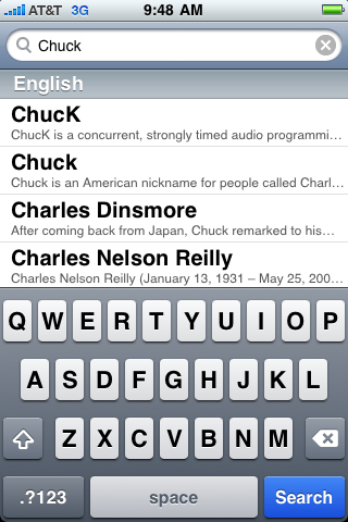
One of the first things you notice about Wikipanion is that it doesn't load predictive guesses right away. After you pause typing for a moment, a list of "suggestions" shows up. As you can see from the screenshot below, our favorite TV hero is nowhere to be found in the first list. Scrolling down reveals he's not even on the front page!
No matter. We click "search" and we get the typical Wiki disambiguation page.
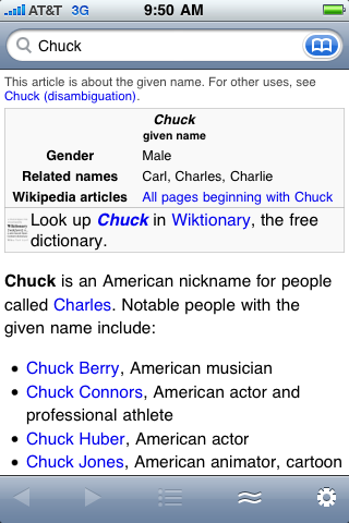
This gives me a chance to say that one of the things I love about wikipanion is how closely it relates to the real Wikipedia. Typically, unless you search for an obvious article, you'll always get to a disambiguation page, and using Wikipanion is no different. Unfortunately, this means we have to scroll way down on the list to find our hero.

Well, not quite the bottom, he's the first "Fictional Character" listed.
Now I can click on the TV Series, and we're brought to a familiar (but mobile-ized) version of a Wiki entry. I love the layout here. Everything's in a single column, easy to find, and thanks to Wikipedia's great navigation, we can get to the list of episodes, the cast list, or anything else we might want, with just a quick scroll.
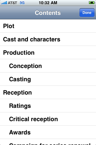
The other great thing is the middle button. You can click it, and get a table of contents for the page you're on. You can see the Chuck one here, which has Plot, Cast And Characters, and a bunch of other great items! This makes it really easy to navigate some of the much larger, more expansive Wiki entries.
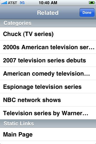
The button to the right of that is the "Related" button, which gives you related links, as seen below. Nothing exciting, but there's some static links on the bottom to go to the Wikipedia home, or to a random page if you're bored.
There's a bookmark feature built into Wikipanion, but I'd rather have it as it's own button. Instead, you have to go to the search bar (always at the top of every page) and click the blue Bookmarks button. Users familiar with Google Maps and most other native iPhone apps will find this easy, but if I'm at the bottom of a long page it's a pain to scroll all the way up to hit my bookmarks.

Also found in this menu is a history tab, which just shows the last pages you've visited. It's not your search history, which some may not like. It's only a record of entries you've actually clicked on.
Also, setting a bookmark requires me to hit the last of the 5 tab bar buttons, then click "More..." then click "Bookmark" and then enter a title. A little complex, but not too bad.
Overall, Wikipanion is a decent program, and I think a good "control" for the rest of the items this week. It's not the best one out there (we'll get to that later) but it's pretty good, and free. We'll also look at the paid Wikipanion Plus, which adds a few features but costs $4.99.
We'll kick things off with the app I had been using for a long time, Wikipanion. This was recommended to me by Dave Most (thanks Dave) and I used it quite a bit. I don't think I need to explain to iPhone users, or internet users in general, what makes Wiki so useful, especially on the go. Anytime one of your friends comes up with a crazy question about some obscure 70's TV show, where do you turn? Wikipedia of course.
The home screen of Wikipanion has a simple search bar. My only major complaint here is that it's kind of slow on the initial load. It looks like you can type right away, but not yet! Once the app loads, you enter your search. For clarity, I'm going to use the same search in every app, one of my current favorite TV shows, Chuck. Chuck's a good example because there's a lot of different uses of the word and name Chuck, and it's only recently that the TV show has started showing up at the top of people's searches.

One of the first things you notice about Wikipanion is that it doesn't load predictive guesses right away. After you pause typing for a moment, a list of "suggestions" shows up. As you can see from the screenshot below, our favorite TV hero is nowhere to be found in the first list. Scrolling down reveals he's not even on the front page!
No matter. We click "search" and we get the typical Wiki disambiguation page.

This gives me a chance to say that one of the things I love about wikipanion is how closely it relates to the real Wikipedia. Typically, unless you search for an obvious article, you'll always get to a disambiguation page, and using Wikipanion is no different. Unfortunately, this means we have to scroll way down on the list to find our hero.

Well, not quite the bottom, he's the first "Fictional Character" listed.
Now I can click on the TV Series, and we're brought to a familiar (but mobile-ized) version of a Wiki entry. I love the layout here. Everything's in a single column, easy to find, and thanks to Wikipedia's great navigation, we can get to the list of episodes, the cast list, or anything else we might want, with just a quick scroll.
The other great thing is the middle button. You can click it, and get a table of contents for the page you're on. You can see the Chuck one here, which has Plot, Cast And Characters, and a bunch of other great items! This makes it really easy to navigate some of the much larger, more expansive Wiki entries.

The button to the right of that is the "Related" button, which gives you related links, as seen below. Nothing exciting, but there's some static links on the bottom to go to the Wikipedia home, or to a random page if you're bored.

There's a bookmark feature built into Wikipanion, but I'd rather have it as it's own button. Instead, you have to go to the search bar (always at the top of every page) and click the blue Bookmarks button. Users familiar with Google Maps and most other native iPhone apps will find this easy, but if I'm at the bottom of a long page it's a pain to scroll all the way up to hit my bookmarks.

Also found in this menu is a history tab, which just shows the last pages you've visited. It's not your search history, which some may not like. It's only a record of entries you've actually clicked on.
Also, setting a bookmark requires me to hit the last of the 5 tab bar buttons, then click "More..." then click "Bookmark" and then enter a title. A little complex, but not too bad.
Overall, Wikipanion is a decent program, and I think a good "control" for the rest of the items this week. It's not the best one out there (we'll get to that later) but it's pretty good, and free. We'll also look at the paid Wikipanion Plus, which adds a few features but costs $4.99.
Thursday, May 28, 2009
iPhone Game: Resident Evil Degeneration
If you love to hate zombies as much as I do, ignore the rest of this review, alt-tab over to iTunes and immediately buy Resident Evil: Degeneration. Not only is it one of the better zombie games I've played of late (on any system), it's by far the best game I've ever seen on the iPhone.
I'm told the game is based on the new Resident Evil movie that's coming out, but I haven't seen any of those and I haven't been keeping track. All I know is, this is an incredible full-3d game that allows you to explore the ruins of an infected airport, killing zombies and solving simple (but entertaining) quests.
The basic concept isn't too far off from any other Resident Evil game. You play as Leon, and you're dropped off in the airport to investigate the "strange" zombie situation. You find that a plane load of infected people has crashed into the airport, and that's where the trouble begins.
You run from area to area in the airport, trying to find survivors and then trying to help keep them alive. Along the way you do a bunch of the standard "find and retrieve" missions that have been the staple of adventure games for years now. You find a locked door, which can only be opened by a key on the other side of the map. You go to get the key, and of course it's guarded by a handful of zombies, who you then shoot in the head.
I'm realizing now that this sounds kind of boring, but the kicker is, it's not. It's incredibly fun, and the ability to pick up new weapons and upgrade them goes a long way towards making you want to keep exploring. Furthermore, it's just plain fun.
The control scheme is pretty well-crafted, although the aiming can take a bit of getting used to. There's a virtual analog stick in the bottom left corner, which you hold with your thumb and move up, down, left and right to move accordingly. Unlike modern shooters, this game is "back to basics" where the stick turns you left and right, rather than strafing.
To fire, you click the weapon button to first arm your weapon. Then the analog stick becomes your aiming mechanism, and you click the target button on the right side to shoot. Some people don't like that you have to stop moving in order to shoot, but it adds to the suspense. You have to get far enough away from the zombies so you can shoot them without them catching up to you.
To make a long story short, this is simply one of the best mobile games I've ever played. I've had a DS, a PSP, and now the iPhone, and this game trumps anything I've seen on all three consoles. If you're looking for a good way to spend six bucks, here you go. Resident Evil: Degeneration.
Tuesday, May 12, 2009
iPhone Chat: IM+ Lite
One of my favorite things about the iPhone is that I can stay connected to my friends and coworkers no matter where I'm located. One of the best examples of this is the IM+ Lite application. IM+ is an instant messaging application which supports AIM, Google, Yahoo, MSN, Jabber, ICQ, Myspace, and Facebook. I personally only use AIM, Google, and Yahoo, but I'm sure all the other services work the same.
When you first boot IM+ you'll be asked to add an account. The process is simple and quick, and will get you chatting right away. Then you'll see your Contacts or Buddy List, on the first tab. You can slide to delete contacts, click them to start a chat session, or click the "i" button to get info like their profile.
The Inbox is the next tab, where you can see what open chats you have, and whether there are any new messages. If you click one of the names, you'll go to the chat screen. It's a simple layout, text on top, type pad on the bottom, and a few buttons to move back to the Inbox, or to close the chat. There's also a smiley menu which allows you to insert graphical smilies, assuming the person on the other end can support that.
One great thing about the chat screen is you can swipe left and right to go from one person to the next. This makes it really easy to maintain a few chat sessions at once, something I'm almost always doing.
The third tab is Status. You can set yourself online, away, invisible, or offline (which disconnects you). Pretty straightforward, pretty useful. Finally, there's a Settings tab, and an About tab. The settings include which accounts to enable, and a whole host of other options about how the app works.
When it comes down to it, a chat client is about ease of use, reliability of connection, and the ability to use multiple chat clients. IM+ Lite covers all 3 bases, perfectly. In the full version, you can send pictures and do voice chat, along with some other add-ons. The free version covers all the bases though, and it's a must-have if you want to stay connected on the go. There's a few other chat options out there, and some of them are decent, but IM+ is by far the most full-featured and easy to use.
Monday, May 11, 2009
iPhone Game: StickWars Lite
You may have noticed by now that I only review apps that are free. This is mainly due to the fact that I'm more or less broke, and hoping that this blog will earn me some cash so I can buy more apps! (Protip: Click the Google Ads found above and below this post to help your favorite app reviewer out!)
To that end, I've got another free game for you: Stick Wars Lite.
I'd like to start by saying I meant to write this post Friday afternoon, but I spent so much time playing Stick Wars Lite that I forgot to actually review it. That right there should tell you just about everything you need to know about this game: it's fun, easy, and addictive, in a way I never expected an iPhone game to be.
A lot of the games out there for the iPhone are basically versions of the old flash games we all used to play on the PC. Or in my case, the old flash games we looked at, tried for 5 seconds, and moved on. See, when you're on the PC, there's so much more content and distraction, that a simple game where you pick up stick figures and throw them isn't that exciting.
However, take that same game, and start playing it while you're waiting in line for the train. Suddenly, it becomes impossible to put down. You're moving towards the back of lines so you can play more. You're going extra stops on the T and then walking so you can play while riding, and while walking down the sidewalk. You're willingly going to the RMV, just for some menial paperwork you could have done online, just so you can play this game. Or something like that.
The gameplay is, overall, pretty simplistic. You have a castle wall, and a bunch of angry stick figures run up to it and try to punch it down. Surprisingly, they can punch through a wall pretty quickly if you don't stop them. You "stop" them by picking them up and flinging them into the air, with your finger. They go flying and eventually hit the ground, exploding into an amount of blood proportional to the "Blood" setting in the options menu.
Sure, you can eventually buy bomb factories, wizard training grounds, and a few other add-ons, but mainly you're going to spend all your time throwing stick figures into the air. It doesn't sound like much, but I promise you it's just about the most fun you'll ever have on your iPhone.
The sound is decent, there's a few little sound effects and some vaguely medieval music. The graphics are pretty poor, but you're dealing with Stick Figures so you get what you expect.
Basically, this is an incredibly fun, addictive game that's appropriate for just about everyone. If you want your kids to play it, just turn off the blood! Tell them you're sending each one of those little sticks to heaven, instead of to a quick death at the hands of gravity.
Friday, May 8, 2009
iPhone Weather App: The Weather Channel
It might seem boring compared to a lot of the games and other apps I use, but there's no app I use more regularly than the latest update to the Weather Channel app. If I could delete the standard iPhone Weather app, I would. The Weather Channel really nailed it with this latest update.
Booting the app takes you to the Current weather screen. You can enter a location (it saves your favorites, and auto-loads your most recent search on boot). There's a pretty little icon that tells you the general weather for the moment, along with some stats like temp, weather, etc. You then have 3 other tabs, Hourly, 36 Hour, and 10 Day, which give you information accordingly.
The app gets really cool though, when you click Explore Map. The Weather Channel uses Google Maps to show you your location, along with the Doppler Radar for the region. You can scroll, zoom, and do whatever else you might normally do on a Google Map. Then you can press "Play" to get a moving version of the map, to see how that latest storm front is moving.
The next tab is the Video tab, which gives you the latest local weather forecast, in video. The video buffers in seconds, and the quality is great. It's a great thing to watch while you're getting dressed in the morning, to see what kind of clothing you should be wearing out there!
The last useful tab is "Severe," which gives a list of any severe weather alerts in the area. The final tab, more, simply hides Help, More Video, and the About screen.
Over all the app is super snappy and incredibly useful. All the information you could possibly need is right at your fingertips. The app loads quickly, closes nicely, and doesn't take up much room overall. If only they could make the icon change based on the current weather for today (something I always wished the regular iPhone Weather App would do). There's a few ads on the app, but they're unobtrusive and just simple banners.
If you need to know what to wear in the morning, or you're trying to plan your weekend, this app is a must have. The weather map is fun to cruise around on, and the video is great. Well played, Mr. Weather Channel iPhone Developer.
Subscribe to:
Posts (Atom)
